Now it's time for the finishing touch on your webpage. This first part isn't HTML related, and in fact, is quite simple. But you'll need to do it before finishing the project.
Lining up your links in the order you want them to appear, instead of the order you type them
As you write a post, the most recent one shows up first on your blog. For a wedding website, though, you'll want the welcome page to show up first. Or an equivalent. And you'll likely want the links on the left to run in a certain order. You have two options for this. You can type them in starting with what you want last, and ending with the homepage. That's a good strategy, until you decide to add pages after you think you're finished. The other option, is to follow these steps.
Then when you're done with that, go into whatever post you would like to show up second. You don't have to worry about the Welcome page because it will have the most recent published date when you're done with this.
As you can see, I put in yesterday's date and 11 PM.
Click Publish Post.
Continue to do this with all of the posts. The next you will do would be the post you'd like to show up third in the links list. Just set it to the previous day's date again, and put in 10PM. Do the same thing with the remaining posts, setting each one back another hour, day, minute, etc. Whichever you'd like to do.
By leaving them in hour increments, it gives you room if you decide to put in another post you'd like to go between the second and third. You can put the time to 10:30 and it will now be the new third link, and all the others will drop below it.
You can see here how the order has changed from the first picture. The posts are now in the order I'd like for them to show up, even though I wrote them in a different order.
And as you go to the website, the Welcome page is the first thing you see.
And on the left, the links are in the right order. But it is still listed by date, and it saves 2009, blog archive, etc. Clearly, you're still looking at a "blog." The next step will take care of that problem.Turning your blog archive into "website links"
This is the look we're trying to achieve. All you see on the left are the links to take you to another page, just like you see on a typical website.
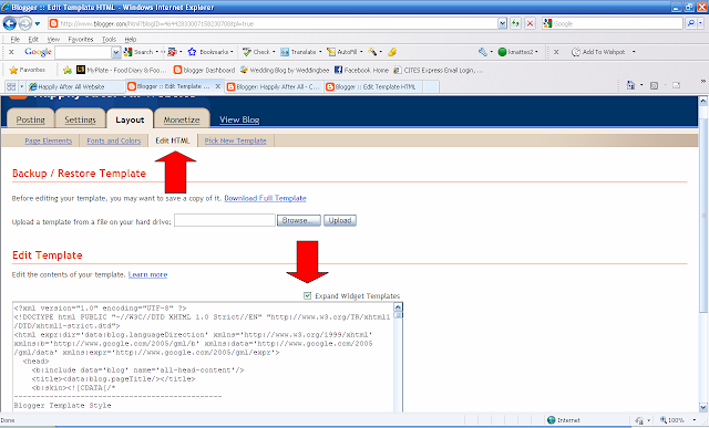
First thing you need to do is click on the Layout tab and go to Edit HTML. There is a small box at the top of the text box that say "Expand Widget Templates." You need to click on this to get to the section we need to be in.
Now may be a good time to save a copy of your template, if you'd like. Just in case you mess this up horribly, you can upload everything you had saved up until this point. That option is at the top of the page.
Scroll down until you find this section, it's towards the very end.
Of the three highlighted lines, erase the bottom one and replace it with the following:Under the line you just entered, enter the following:
Where it says 'websiteoflink' replace it with the website of the link you want. For instance, the first one for my website is the Welcome page. So I would go to my website, click on welcome, and in the bar at the top it would say
http://www.happilyafterallwebsite.blogspot.com/2009/11/sample-post.html
It says sample-post instead of welcome because that was the original title of that post. This isn't a huge deal to me, but just be aware that when you change the title of a post, the web address doesn't change.
So I would insert that whole address into the 'websiteoflink' area, but make sure you leave the ' and ' at the beginning and end of it.
Then where it says linkyouwantdisplayed I put Welcome because that is what I want the link on the left hand side to say.
Repeat this for every entry that you have. If you click on the picture it will enlarge and you can see how I put in every post.
At this point, click save and go look at your website. If you did it correctly it should look like this.
The links at the top have replaced the previous words "Blog Archive." At this point you still have the archived links below it. Now we'll remove those.
Go back into the edit HTML section. Scroll a little above the section we just edited. Look for the following:
Now delete the highlighted section. You'll be left with this.As you can see, the two lines that are highlighted now were in the previous picture, and the space in between is the text you just deleted. Save the template and go look at the website. You should have something that resembles this if you did it correctly.
At this point you can be done if you'd like, your website is now de-blogged. Or you can look out for the final episode of this mini-series. There are just a few more codes to tweak your website, so stay tuned.


No comments:
Post a Comment